
Executive Overview
Two decades after the events of September 11, 2001, the contemporary cultural and political landscape remains indelibly stained by a single chromatic spectrum: orange. What began as the violent, incandescent burst of jet fuel against steel and sky quickly metastasized into an administrative apparatus, a bureaucratic framework, and eventually, an ambient atmospheric condition of Western life.
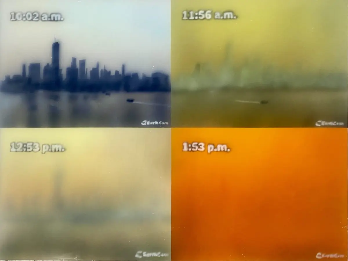
In cultural criticism and visual art, the trajectory of this color has become a subject of profound reexamination. As explored in recent critical analyses of post-millennial iconography—such as Dushko Petrovich Córdova’s meditation on color, memory, and statecraft—the transition from a purely physical phenomenon to an institutionalized regime reveals how human psychology can be systematically captured by visual cues.
The implementation of the Homeland Security Advisory System (HSAS) in March 2002 institutionalized a permanent state of low-grade emergency. By positioning "High Risk" (Orange) as the baseline setting for national anxiety, the federal government did not merely communicate danger; it cultivated a perpetual ecosystem of alertness. This deep dive investigates how the color orange evolved from a natural byproduct of catastrophe into a bureaucratic ideology, reshaping journalism, architecture, transit, and the internal emotional landscape of a generation.
Read Also
Detailed Chronology: From the Ashes to the Advisory Grid
To understand the hegemony of orange, one must retrace the precise sequence of events that tethered visual memory to geopolitical trauma.
September 11, 2001: The Fracturing of the Visual Record
In the collective imagination, the transition from an analog, muted media landscape to a hyper-saturated era of perpetual risk is anchored to the morning of September 11. While historical records indicate that major publications like The New York Times had technically introduced color photography to their front pages years earlier—notably on October 16, 1997, with muted tones capturing a Cleveland Indians uniform and Janet Reno before the House Judiciary Committee—the visual paradigm shifted permanently on 9/11.
The enduring mental image of that morning is rarely captured in pure historical accuracy. Rather, it lives as a composite: the pale blue sky, the rigid, grid-like geometry of the twin gray towers, and the brilliant, impossible burst of orange fire. This orange flame served as a violent rupture in the visual documentation of news. It shattered the monochrome safety of late-20th-century journalism, establishing a new visual grammar where catastrophe was rendered in high-definition, arresting hues.
March 2002: The Codification of Risk
Within six months of the attacks, the Bush administration sought a mechanism to translate diffuse public anxiety into manageable, quantifiable data. The result was the Homeland Security Advisory System, unveiled by the Department of Homeland Security (DHS) in March 2002.
The color-coded scale featured five tiers:
- Green: Low
- Blue: Guarded
- Yellow: Elevated
- Orange: High
- Red: Severe
While "Red" denoted imminent, catastrophic danger, and "Green" and "Blue" represented theoretical baselines of absolute safety that were rarely if ever deployed, the system quickly stagnated on Orange. It became the operational sweet spot of the American security apparatus: high enough to justify sweeping legislative and physical interventions, yet low enough to signal that the state was successfully managing the threat without collapsing into total emergency.
The Mid-2000s: The Orangification of Daily Life
By the mid-2000s, the color had saturated the built environment. It migrated from classified intelligence briefings onto cable news chyrons, airport security checkpoints, subway stations, and highway digital billboards. Citizens were conditioned to scan these visual indicators much like they scanned weather reports. The color ceased to be a warning of an incoming event and became an environmental constant. Emergency had been industrialized, transformed from an acute crisis into a chronic, low-level way of life.
Supporting Context & Metrics: The Psychology of the Chromatic Regime
The deployment of the HSAS was not merely a logistical failure or bureaucratic novelty; it was an unprecedented exercise in mass psychological conditioning.
Color Theory and the Escalation of Vigilance
In elementary color theory, the spectrum is neatly divided. Cool tones (blues, greens) denote safety, tranquility, and stasis. Warm tones (yellows, reds) signal heat, passion, and, by extension, danger. Traffic lights transition inexorably from green to yellow to red. Across educational posters, meteorological warnings, and industrial safety manuals, red has always meant absolute stoppage: "Red means run, son."
By inserting Orange into the upper echelon of the threat matrix, the DHS manipulated this traditional hierarchy. Orange occupies the liminal space between caution and catastrophe. It is bright enough to seize immediate neurological attention—triggering the amygdala and raising cortisol levels—yet ambiguous enough to sustain prolonged exposure without triggering outright societal panic.

The Metrics of Perpetual Anxiety
Sociological and media studies tracking the era reveal striking metrics regarding the durability of the Orange regime:
- The Baseline Effect: Between March 2002 and the eventual retirement of the HSAS in 2011, the threat level for domestic aviation and general infrastructure never dropped below Yellow (Elevated), and spent the vast majority of its operational life sitting firmly at Orange (High).
- Media Saturation: Major cable news networks (CNN, Fox News, MSNBC) integrated permanent color-coded threat tickers into their morning broadcasts. Viewers were subjected to the visual cue of Orange thousands of times over the decade, subconsciously linking their morning coffee and daily routine with the existential threat of international terrorism.
- Economic Externalities: Billions of dollars were funneled into physical infrastructure modifications—reinforced bollards, trash-can removals, blast-resistant glass, and checkpoint queuing systems—all color-coded or structurally designed to echo the aesthetic of the Orange alert era.
Official Statements and Institutional Rationales
When the Homeland Security Advisory System was introduced, federal officials defended it as an essential tool for inter-agency communication and public awareness. However, the system’s inherent vagueness quickly drew sharp criticism from both civil liberties organizations and the very law enforcement agencies tasked with enforcing it.
The Administration’s Defense
Proponents within the Office of Homeland Security argued that a unified visual system was necessary to bridge the communication gap between federal intelligence agencies and local municipalities.
"The color-coded threat level provides a comprehensive and effective means to disseminate information regarding the risk of terrorist acts to federal, state, and local authorities and to the American people," stated early DHS briefing documents. "It allows all levels of government and the private sector to calibrate their security posture in response to credible intelligence."
The Critique of Vagueness
As the years progressed, critics pointed out a critical flaw that distinguished the HSAS from traditional safety protocols. In standard emergency education—such as fire drills or tornado warnings—a specific threat level is inextricably paired with an actionable protocol: In a fire, evacuate the building. In a tornado, seek interior shelter.
The HSAS offered no such clarity. When the dial was turned to Orange, citizens were given no specific instructions other than to "be alert" and to "continue with your daily lives." Law enforcement agencies were placed on high alert, but the public was left in a state of suspended agency.
Tom Ridge, the first Secretary of Homeland Security, later acknowledged the psychological toll and logistical limitations of the system, admitting that the constant reliance on Orange and Red created a "boy who cried wolf" dynamic that eventually desensitized the public it was designed to protect. In April 2011, under Secretary Janet Napolitano, the DHS officially scrapped the color-coded grid in favor of the more nuanced National Terrorism Advisory System (NTAS), which relied on specific, time-bound alerts rather than an ambient, permanent dial.
Future Outlook: Living in the Aftermath of the Orange Era
Though the physical color-coded boxes have vanished from airport terminals and cable news screens, the legacy of the Orange regime endures. It fundamentally altered the relationship between the citizen and the state, normalizing the intrusion of security theater into everyday spaces.
The Artistic and Cultural Reckoning
Today, contemporary artists and theorists are actively excavating the psychological debris of the post-9/11 decade. Works like Dushko Petrovich Córdova’s EarthCam series—which capture mundane, pixelated slices of American life through acrylic and glass—serve as an artistic meditation on this era. By freezing views of urban environments through screens and digital mediums, these works ask viewers to confront how completely our visual environment was colonized by the aesthetics of surveillance and state anxiety.
The "orangification" of the modern world demonstrated that prolonged crises do not always manifest as dramatic, explosive events. Often, they become normalized as part of the visual background. The bright, high-visibility orange of construction zones, security vests, and emergency barriers now bleeds seamlessly into our political and cultural lexicon.
Looking Ahead
As we navigate new frontiers of global uncertainty—ranging from cyber warfare and algorithmic disinformation to biological threats and climate collapse—the lessons of the Homeland Security Advisory System remain stark. Future governance models must grapple with the temptation to weaponize ambient fear.
The transition away from permanent color-coded dials was a necessary step toward administrative maturity, but the cultural muscle memory remains. The challenge for modern journalism, civic institutions, and the public is to demand transparency without sliding back into the hypnotic comfort of perpetual, institutionalized alarm. Only by recognizing how deeply color and design can manipulate the collective psyche can society hope to construct a future governed by clarity rather than chromatic panic.





Comments
Facebook App ID not configured. Please add it in the Customizer.