
Executive Overview
In a significant leap forward for digital reading accessibility, Amazon has officially integrated the acclaimed Atkinson Hyperlegible font into its expansive ecosystem of Kindle e-readers, mobile apps, and select tablet interfaces. Developed originally by the prestigious Braille Institute, this typeface is specifically engineered to bridge the gap for readers with low vision, visual impairments, and specific reading challenges. By maximizing character differentiation, reducing visual ambiguity, and pairing seamlessly with Kindle’s robust suite of customizable typesetting tools, Amazon is setting a new industry standard for inclusive technology.
This integration is not merely a cosmetic update; it represents a fundamental shift in how digital reading hardware addresses the diverse physiological needs of its user base. Millions of readers worldwide—ranging from aging demographics experiencing age-related macular degeneration to younger readers grappling with visual processing differences—stand to benefit from this rollout. Spanning current-generation Kindle e-readers, Alexa-enabled tablets, and the Kindle mobile applications for Android and iOS, the inclusion of Atkinson Hyperlegible cements Amazon’s commitment to universal design principles in the digital publishing landscape.
Detailed Chronology: The Journey to Inclusive Typography
The arrival of the Atkinson Hyperlegible font on Kindle devices is the culmination of years of collaborative typographic innovation, user-centric research, and iterative software deployment.
Read Also
The Origins of Atkinson Hyperlegible
Long before its integration into Amazon’s hardware lineup, the typography community recognized a glaring deficiency in standard digital fonts. Traditional typefaces—such as Helvetica, Times New Roman, or even publisher-specific defaults—often prioritize aesthetic minimalism or historical tradition over functional legibility. For individuals with low vision, characters with similar geometric structures frequently blur together, causing cognitive fatigue and misread words.
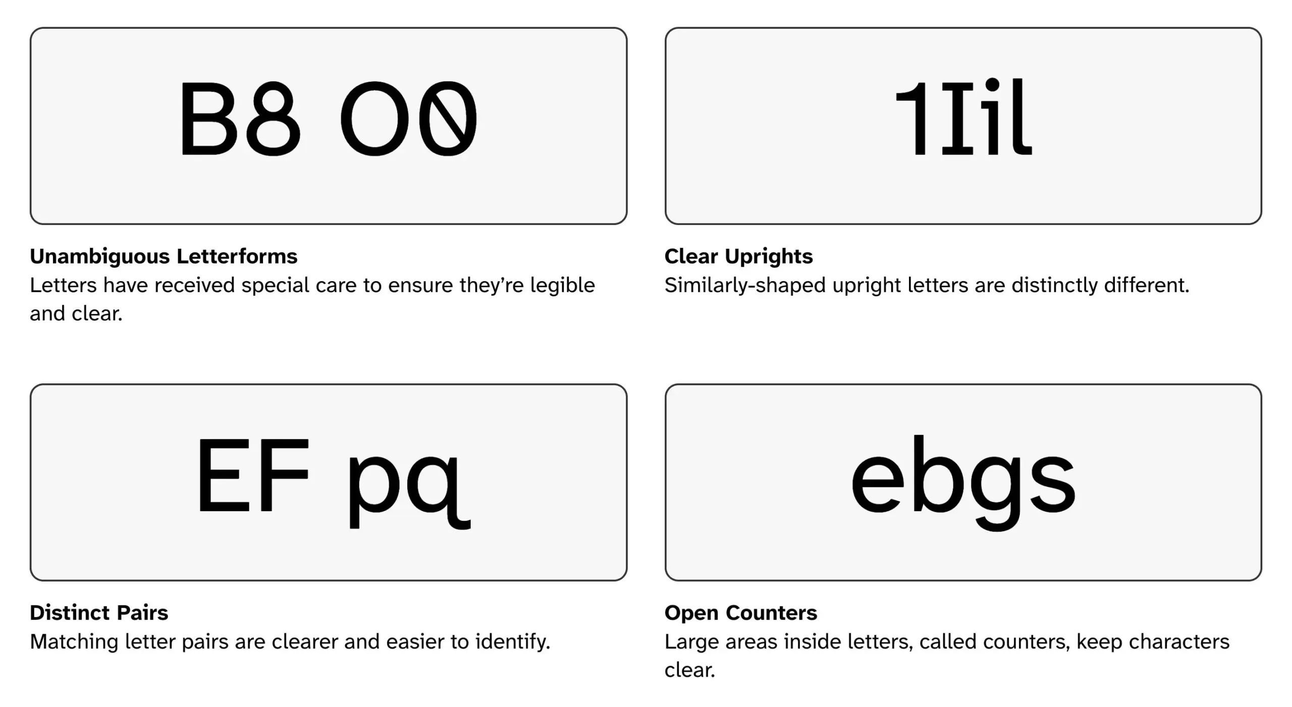
To combat this, the Braille Institute partnered with Applied Design Works to create a typeface named in honor of the Institute’s founder, J. Robert Atkinson. Released as a free public resource, Atkinson Hyperlegible was meticulously crafted to solve the most common legibility pain points. Rather than relying on traditional, subtle variations, the font designers deliberately exaggerated character forms. They introduced distinct tails, pronounced serifs, and open counters to ensure that every letter and number possesses a unique, unmistakable visual identity.
Integration into the Kindle Ecosystem
For years, Kindle users relied on a dependable, albeit limited, selection of default fonts, such as Bookerly, Caecilia, and OpenDyslexic. While functional, none offered the hyper-focused clarity required by a significant subset of readers with severe low vision.
The integration process began as software engineers and accessibility advocates recognized the growing demand for the Braille Institute’s typeface across electronic paper (E Ink) displays. Adapting a complex font for low-refresh-rate E Ink screens presented unique technical challenges, requiring rigorous testing to ensure that character rendering remained crisp across various display resolutions—from entry-level 1600-pixel entries to high-density 300 PPI Paperwhite and Scribe panels. By 2026, the technical hurdles were cleared, culminating in a seamless software update deployed globally across current-generation Kindles, mobile apps, and tablet interfaces.
Supporting Context & Metrics: Anatomy of a Legible Typeface
To understand why the integration of Atkinson Hyperlegible is a monumental win for digital readers, one must examine the specific design mechanics that set it apart from conventional fonts.
Common Visual Confusions vs. Atkinson Hyperlegible Solutions:
┌────────────────────────┬────────────────────────────────────────────────────────┐
│ Character Pair         │ Typographic Differentiation Strategy                   │
├────────────────────────┼────────────────────────────────────────────────────────┤
│ lowercase 'l' / 'I' /1 │ Distinct footers, serifs, and angled tops prevent blur │
│ digit '0' / 'O'        │ Narrower zero versus wide, circular uppercase letter   │
│ uppercase 'B' / '8'    │ Unbalanced top/bottom loops prevent optical merging    │
└────────────────────────┴────────────────────────────────────────────────────────┘
Deconstructing the Letterforms
The core philosophy behind Atkinson Hyperlegible is simple: what you read should never require guesswork.
- The "l", "I", and "1" Conundrum: In many modern sans-serif fonts, the lowercase letter "l", the uppercase letter "I", and the number "1" are nearly indistinguishable vertical strokes. Atkinson Hyperlegible addresses this by giving the lowercase "l" an upturned tail at the base, capping the uppercase "I" with distinct top and bottom serifs, and giving the number "1" a sharp, pronounced flag at the upper left.
- Distinguishing "0" and "O": Zeroes and uppercase O’s frequently trap readers’ eyes. The font utilizes an unmistakably round, wide uppercase "O", while the numeral zero is subtly narrowed and distinct, ensuring zero ambiguity in numeric-heavy texts or financial documents.
- Preventing "B" and "8" Mergers: The upper and lower loops of the number "8" and the uppercase letter "B" are intentionally weighted and separated to prevent them from bleeding together on lower-contrast screens or at smaller font sizes.
Limitations and Nuances
While the font has achieved critical acclaim, experts note important caveats regarding its use. Because of its exaggerated forms and intentional open spacing, Atkinson Hyperlegible can sometimes appear overly utilitarian, plain, or structurally loose when scaled up to massive proportions for display headers or book titles. It excels primarily in body text, user interface (UI) elements, captions, and footnotes.
Furthermore, while many readers with dyslexia report significant reading improvements due to the sharp character differentiation, the font was not strictly engineered as a dedicated dyslexia-specific typeface. For instance, some readers still experience mirror-image confusion with traditionally symmetrical or semi-symmetrical characters like lowercase "p", "q", and "b". Consequently, users with severe dyslexia may still prefer specialized fonts like OpenDyslexic, making the availability of multiple font options on the Kindle an absolute necessity.
Ecosystem Synergy: Customization and UI Enhancements
Font choice is only one component of the reading equation. Amazon’s recent software updates ensure that Atkinson Hyperlegible pairs seamlessly with an advanced array of typesetting and layout configurations, allowing users to craft a truly bespoke reading environment.
Granular Layout Control
Kindle users are no longer bound by rigid publishing defaults. The platform now offers microscopic control over:
- Margins and Spacing: Users can independently adjust line spacing (leading), paragraph breaks, word spacing, and character tracking. Wider spacing dramatically reduces visual crowding (the "crowsing effect"), which is a primary trigger for eye fatigue in low-vision readers.
- Text Alignment: While fully justified text is traditional for print books, it often creates uneven, distracting white spaces ("rivers") between words. Kindle allows readers to switch instantly to left-aligned (ragged-right) text, which maintains uniform word spacing and significantly enhances reading comprehension and focus.
- Color Schemes and Dark Mode: Beyond standard page colors, users can invert displays with robust "Dark Mode" implementations, reducing glare and high-luminance strain during nighttime reading sessions.
Custom Themes and UI Scalability
For users navigating the Kindle operating system itself, current-generation devices feature adjustable text scaling for all UI elements, menus, and library displays. Once a reader finds their ideal combination of font, size, spacing, and alignment, they can save these parameters as a Custom Theme. This feature allows users to switch effortlessly between an intensive study layout and a relaxed leisure-reading format with a single tap.
Official Statements and Industry Impact
The integration of the Braille Institute’s font into mainstream consumer hardware has sent positive ripples through both the accessibility community and the publishing industry.
Industry analysts have praised Amazon for prioritizing functional accessibility over purely aesthetic software design. In a statement regarding the broader impact of inclusive typography, accessibility advocates noted that mainstreaming designs like Atkinson Hyperlegible normalizes assistive technology, removing the stigma historically associated with specialized reading tools.
"When universal design principles are baked directly into consumer hardware used by millions, accessibility stops being an afterthought and becomes a foundational standard," notes digital publishing ergonomics researcher Dr. Elena Vance. "By putting an award-winning, highly legible font directly into the hands of Kindle users worldwide, Amazon has fundamentally improved the daily lives of countless individuals who previously struggled against the limitations of conventional typography."
Future Outlook: The Horizon of Digital Accessibility
As electronic paper technology matures, the intersection of typography, hardware design, and cognitive science will continue to evolve. The successful deployment of Atkinson Hyperlegible across Kindle e-readers, Alexa tablets, and mobile apps opens the door for even more sophisticated accessibility features in the pipeline.
What Lies Ahead?
- Dynamic Type Adaptation: Future iterations of reading software may utilize front-facing sensors or user-behavior analytics to automatically suggest optimal font weights, sizes, and spacing based on ambient lighting and reading speed.
- AI-Driven Typographic Tuning: Artificial intelligence could soon assist publishers in automatically formatting digital manuscripts to adhere to high-legibility standards, ensuring that self-published and indie titles match the accessibility of major releases.
- Expanded Font Libraries: Building on the momentum of the Atkinson integration, Amazon may partner with other global accessibility organizations to introduce specialized non-Latin scripts (such as Cyrillic, Arabic, and CJK variants) designed with similar hyper-legible methodologies.
Ultimately, the arrival of Atkinson Hyperlegible on the Kindle platform marks a monumental victory for inclusive design. It proves that technology corporations can successfully merge commercial scale with profound social impact, ensuring that the transformative joy of reading remains accessible to everyone, regardless of visual ability.





Comments
Facebook App ID not configured. Please add it in the Customizer.